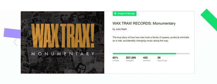
We spend a lot of time sharing our enthusiasm for Kickstarter projects, whether it’s with our Staff Picks, the Project of the Day, newsletters like Projects We Love, or just tweeting and Facebooking and Instagramming inspiring new ideas. That means we spend a lot of time answering two important questions:
1. How do you choose which projects to feature?
We have a whole team of people in our office with backgrounds in all sorts of creative fields. When we spot projects we think are really exceptional, we try to let the world know about them. It’s really that simple.
2. How can I get my project featured?
The easy answer: Build a wonderful, exceptional project!
Most of this is about having a great idea, a great talent, or something really unique to show people. But no matter what you’re working on, there are loads of things you can do to make sure your project page is polished, attractive, well-built, and shareable. Here are the major points.
- Choose a great project image. Keep it crisp, clear, bright, and simple. We made a whole guide to help you do just that, and it’s well worth checking out.
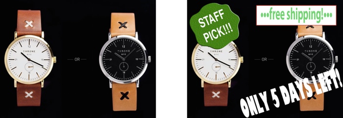
- Don’t cover your images with badges, banners, or stamps. No “STAFF PICK!” splashes. No “STRETCH GOAL!” badges. No Final Day banners. These things just obstruct your project image, and using them makes you much, much less likely to be featured. We won’t be able to share your images in new places, and neither will your backers.

- Write a great blurb. Keep that clear and simple, too. You don’t need a lot of hype (“BEST PROJECT!!!1!!”) — just let people know what you’re making. Check that it’s free of typos, too.
- Respect people’s time. Make sure your project page starts with a quick, clear statement of what you’re doing — don’t make people hunt for it. Save the introductions and backstory for further down the page. If someone were just skimming the first two paragraphs, what would you want them to see?
- Use lots of high-quality media. Compelling photos, videos, GIFs, audio, and screenshots are all great. More media is almost always a terrific thing. Just try to get each piece as polished and high-resolution as you can — something that would really catch your eye if you scrolled past it on Facebook or Twitter. (Free tip: animated GIFs tend to be a huge hit on social media.)
- Show your rewards. If you have finished or near-finished examples of what you’re making — or even previous, similar works — get great photos of them, and feature them prominently! It’s the most striking and motivating thing you can have online: a picture that says “we make these amazing things, and you could get one.”
- Remember your audience. Kickstarter’s an all-ages website, so it helps if your main images and text aren’t too vulgar or risque. And our community is largely English-speaking — so if you’re using other languages, it helps to include translations. Subtitles and captions for video help, too. That way, you can make sure everything you’re saying is available to the broadest possible audience.
If you’ve ever wondered how to be a Kickstarter Staff Pick, now you know. With thousands of projects live at a given time, we can’t feature every project. But if you follow the steps outlined above, you’ll have the best possible chance of catching our eye, and creating a project that your audience will love.
This post was originally published on this site

No Comment